
SaaS platform redesign — Eplano
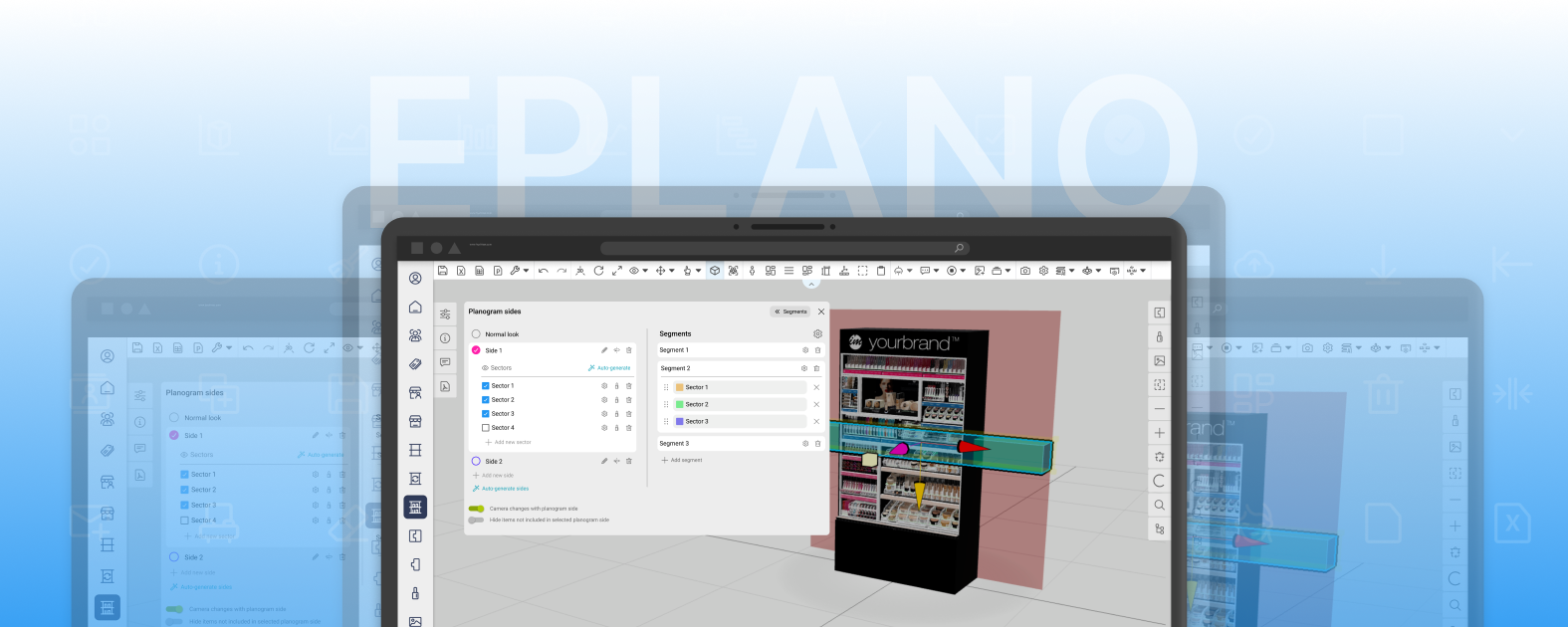
Eplano is a SaaS tool for building planograms and visualizing product displays in 3D. The redesign focused on tidying up the interface, unifying patterns, and simplifying key actions — so that everyday work in the app is faster, more consistent, and easier to read.
Context
Eplano's interface had grown organically as new features were added. Over time this led to inconsistent patterns, cluttered panels, and repetitive actions that made an already advanced tool harder to use. The goal of the redesign was to restore order and consistency — without stripping the tool of its power.
Discovery — how I defined the problems
This wasn't a project driven by formal user research. The starting point was a brief from the client and the development team, along with needs that users had reported earlier from inside the live app. Building on that, I ran my own UX analysis of the existing interface and cross-checked my conclusions with the development team — to separate real design problems from technical constraints.
business expectations, feature context, and known technical constraints.
needs and problems raised earlier in the production app.
a review of existing screens for consistency, hierarchy, and repeated patterns.
checking feasibility and how features work under the hood.
Problem
- Overloaded panels and weak information hierarchy.
- Inconsistent patterns across screens.
- Repetitive and duplicated actions.
- Distracting button colors competing for attention.
Goals
- Tidy up the panels and strengthen the hierarchy.
- Unify patterns and the placement of key actions.
- Simplify the interface — remove duplicates and redundancy.
- Build a consistent, legible visual system and iconography.
Process — the "Choose option" dialog
A good example of how I work is the redesign of the dialog for adding and replacing a planogram on a fixture. The client provided an initial vision of how the feature should work, and I translated it into successive UI iterations — from a raw layout with large, competing buttons, through ordering the action hierarchy, to a coherent version aligned with the rest of the interface.
- 01Input from the client
An initial idea for how the "add / replace planogram" feature should work, plus use cases.
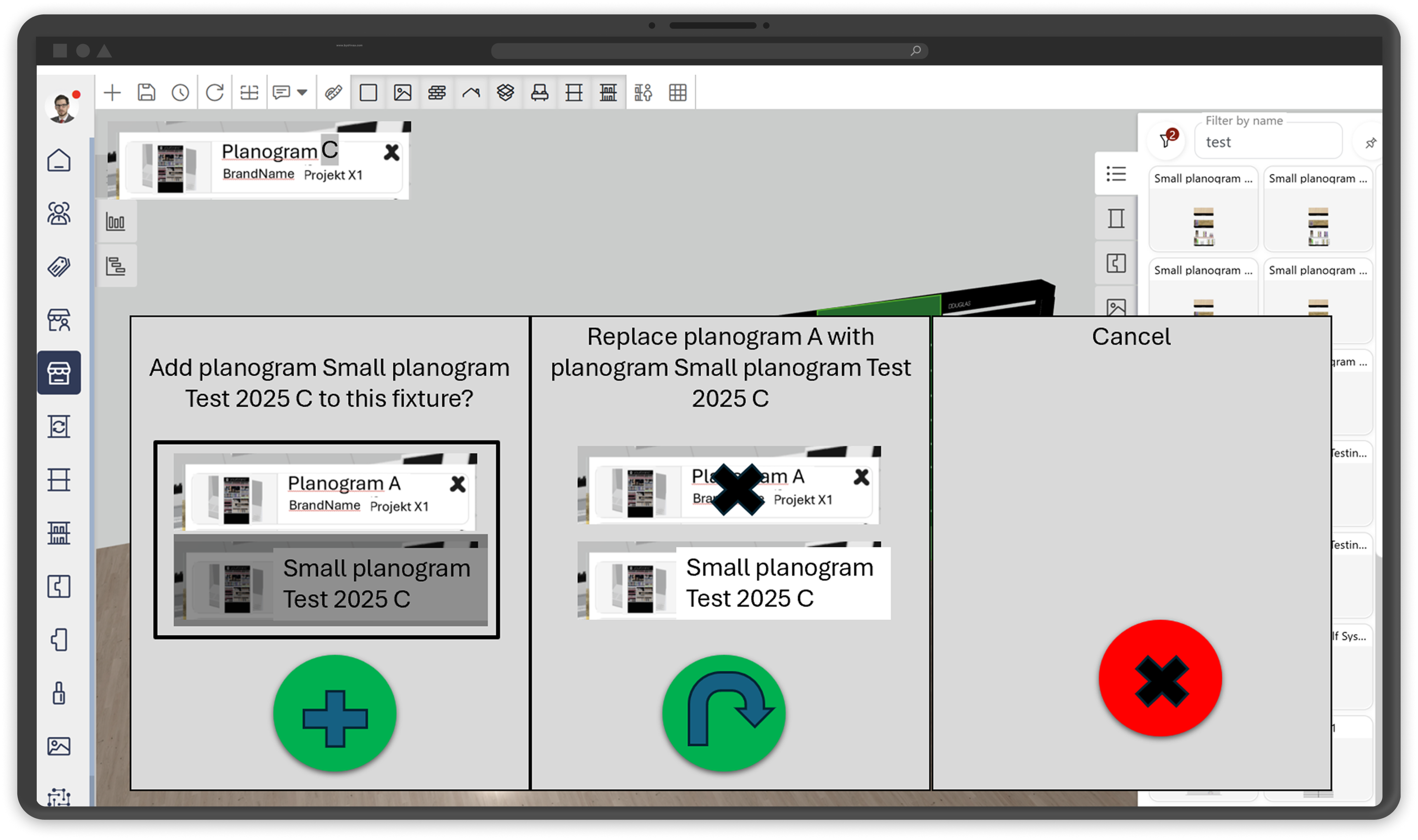
- 02Early iteration
A raw layout: large, heavily colored action buttons and an unclear hierarchy.
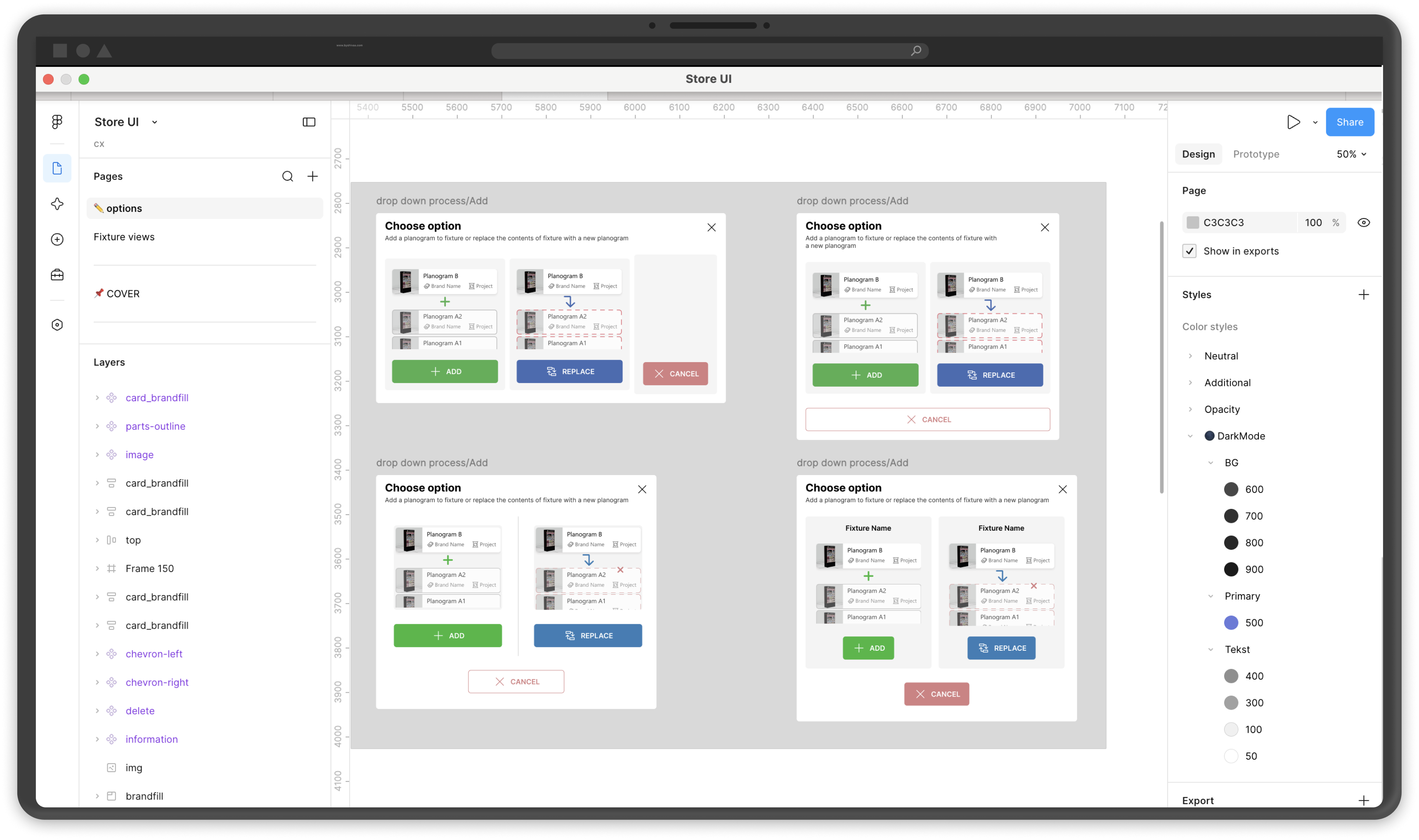
- 03Ordering
Unifying the "Add / Replace / Cancel" cards, separating the destructive action, and applying consistent spacing.
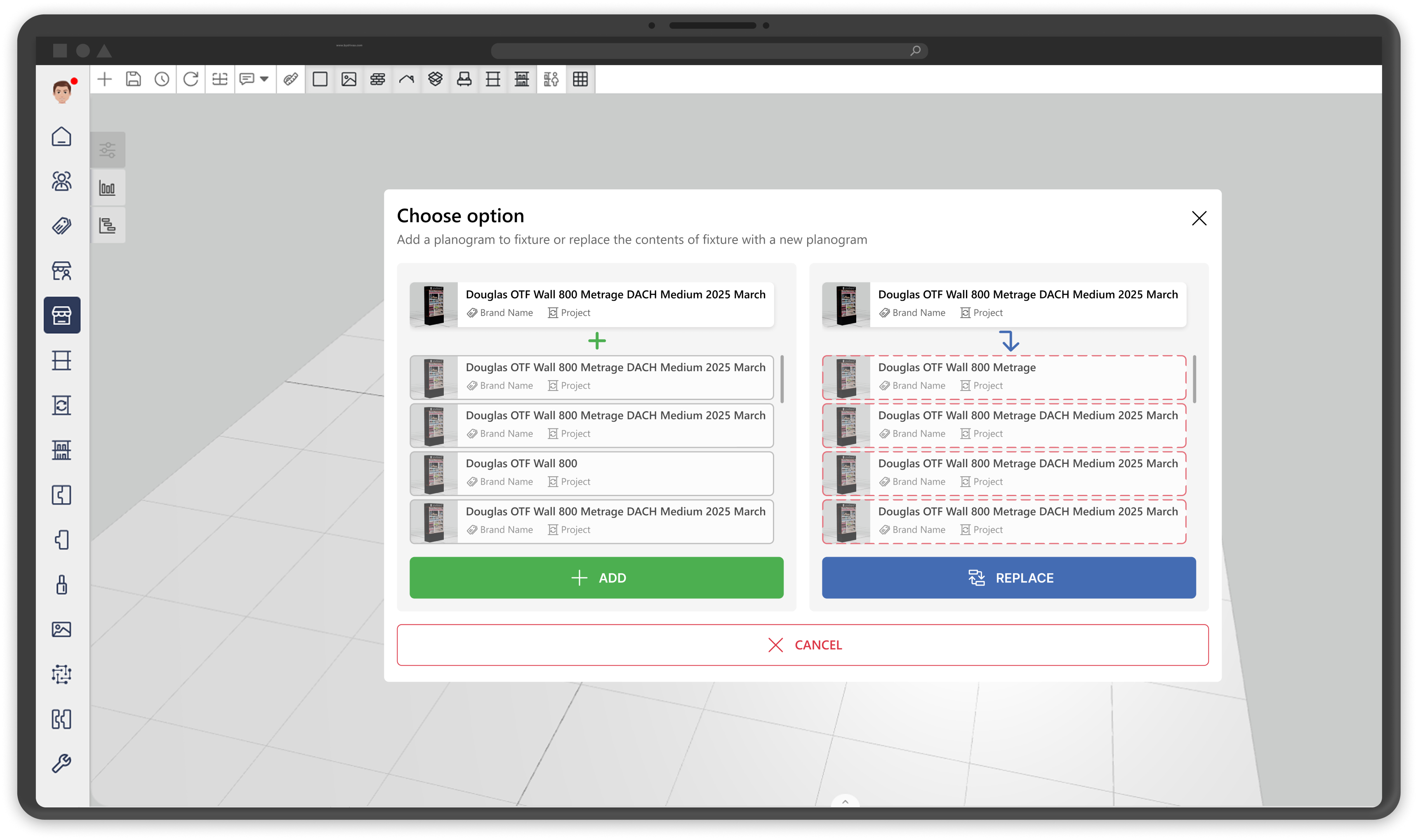
- 04Final version
A clean modal aligned with the system: a clear heading, predictable CTAs, and distinct replacement states.
Before and after — the "Planogram sides" panel
Drag the slider (or use the arrow keys) to compare the previous and new versions of the panel.
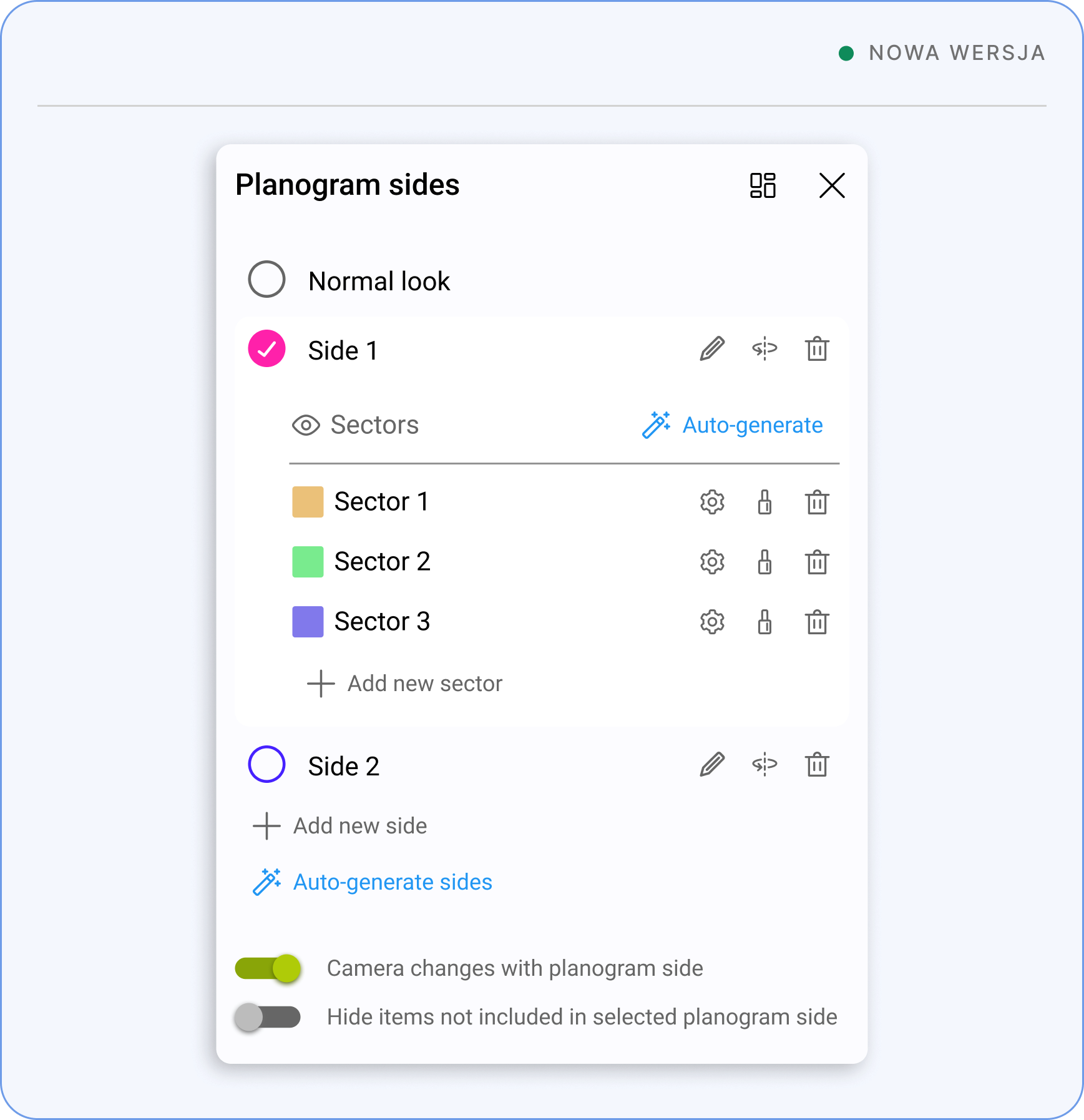
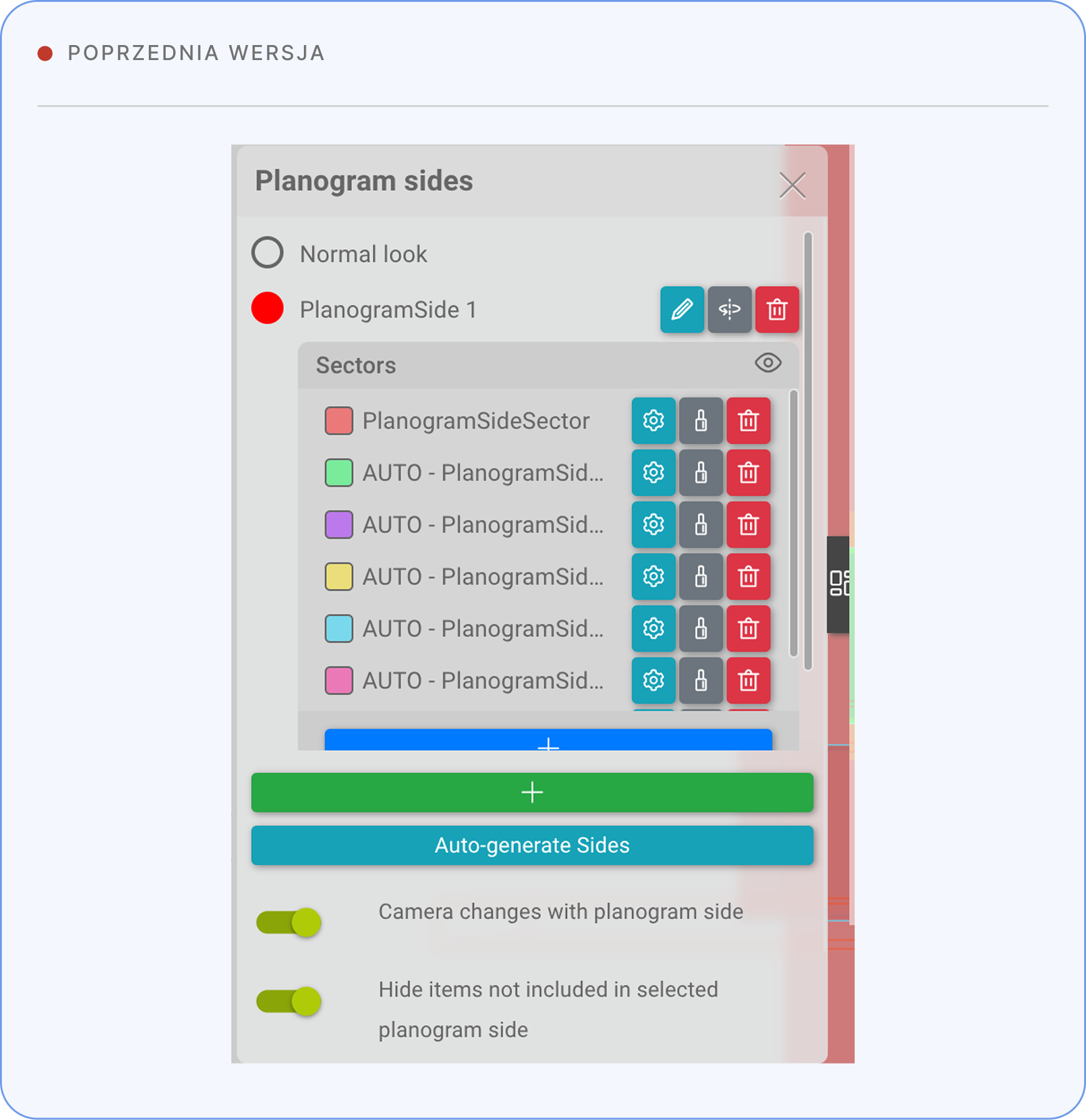
The new version: a readable list of sectors, muted icon actions, a clear selected state, and an ordered hierarchy instead of colorful, competing buttons.
Key UI/UX decisions — the "Planogram sides" panel
- 01Sides
The selected Side is visually highlighted, making it easy for the user to quickly understand which area they're currently working in.
- 02Color
Bright, heavily saturated buttons were replaced with neutral colors. Color is now used only as an accent, and reducing color cuts visual noise and makes it easier for the user to focus on the most important elements.
- to mark the selected Side or a completed action,
- to identify sectors.
- 03Buttons
Large, colorful buttons were simplified and replaced with smaller icon links. Actions like "+ Add new side" or "+ Add new sector" were placed directly as a continuation of the list. This way the main actions no longer compete visually with the list content, and the interface is clearer and more consistent.
- 04Auto-generate sectors
The "Auto-generate sectors" button was moved next to the Sector heading. This keeps it from clashing with the similar "Auto-generate sides" button and preserves a consistent logic for where actions live in the interface.
- 05Segment setting
The "Segment" button was moved from the side panel to the top of the window, next to the heading. The new location clearly shows that Segment is an independent feature, not an action tied to a Side or Sector.
Icon set
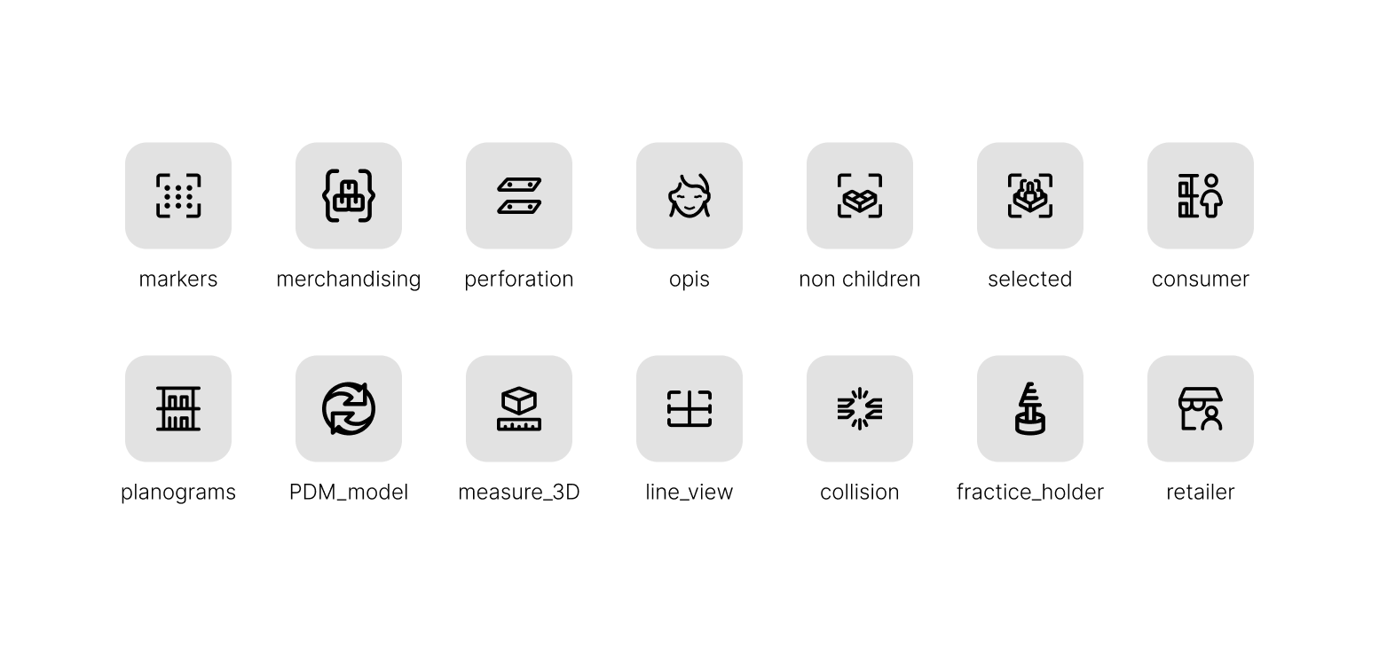
A custom icon set designed specifically for the Eplano domain — planograms, merchandising, 3D measurements, collisions, and PDM models. A uniform style, consistent line weight, and shared grid keep everything coherent across the interface.
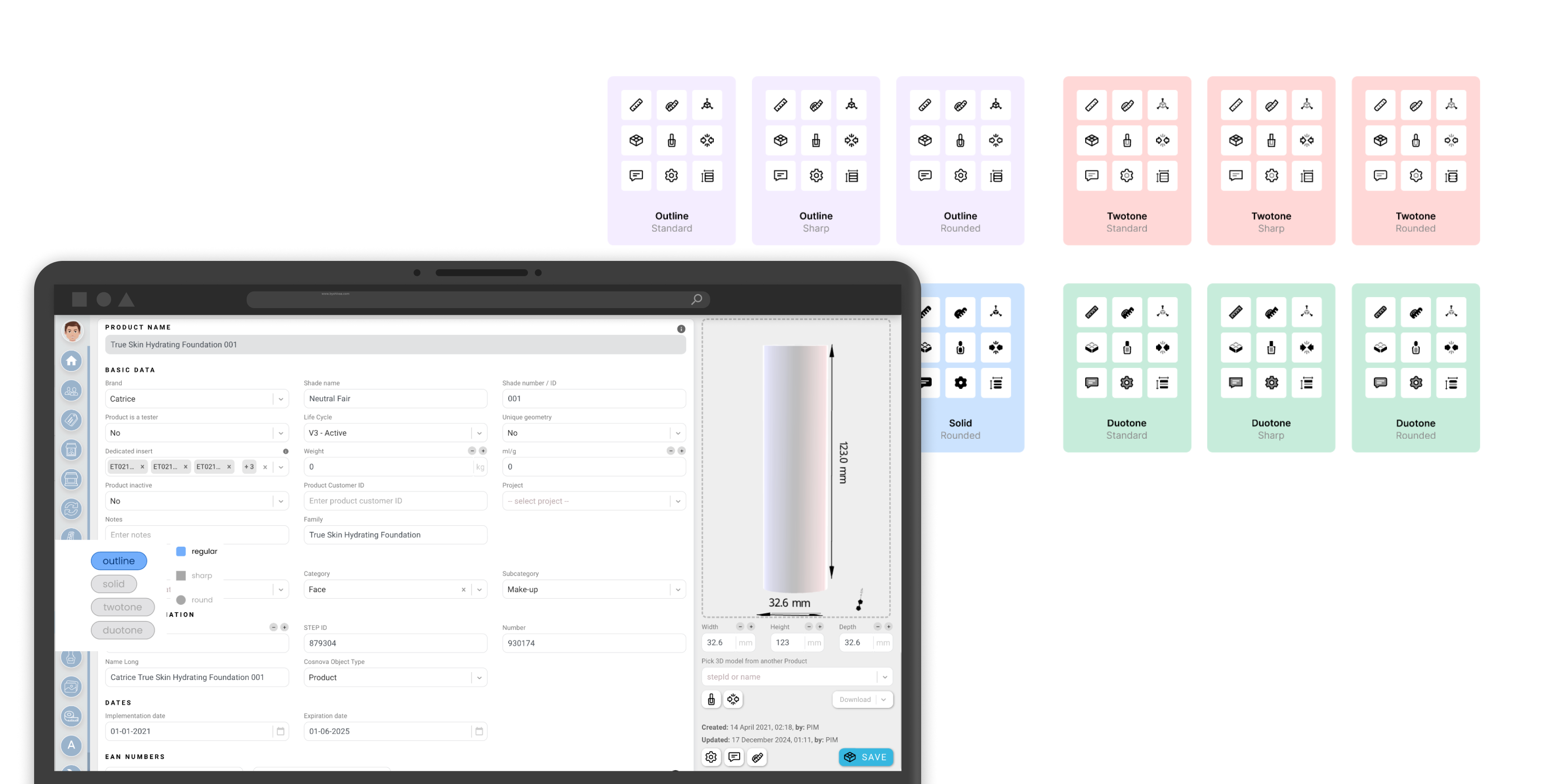
Before settling on the final direction, I prepared several style variants (including outline, solid, twotone, and duotone in standard, sharp, and rounded versions) and tested them directly in the live app. A style switcher let me compare icon legibility in a real interface context, not just on a grid in Figma.
My role and contribution
I was responsible for shifting the app's visual layer toward a mature UI and for refining the functional dialogs from a UI/UX angle — taking into account user needs reported earlier in the app. I worked closely with the development team, consulting on feasibility and the rollout of each change.
Revising and unifying the interface's visual style.
Redesigning the key functional dialogs.
Tailored to the domain — design, variants, and in-app testing.
Feasibility consulting and rollout support.
Outcome
The changes were rolled out to production after internal testing — the team reviewed the final versions, and developers made adjustments as needed.