Accounting office owner
Goal: quickly judge whether the tool would improve the office's work and book a demo.
Frustration: a wall of text with no clear message made the offer hard to evaluate.

EBR is an app and sales page for an accounting-office management tool. The redesign focused on tidying up the page, building a clear visual system, and strengthening the conversion path — so the product would look modern and inspire trust.
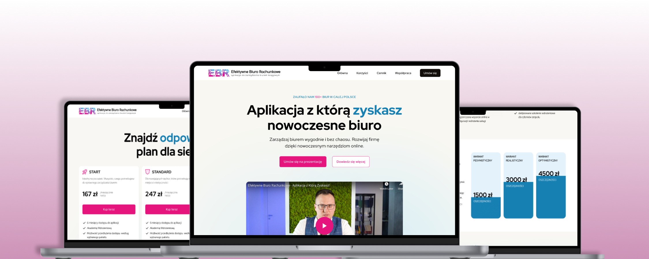
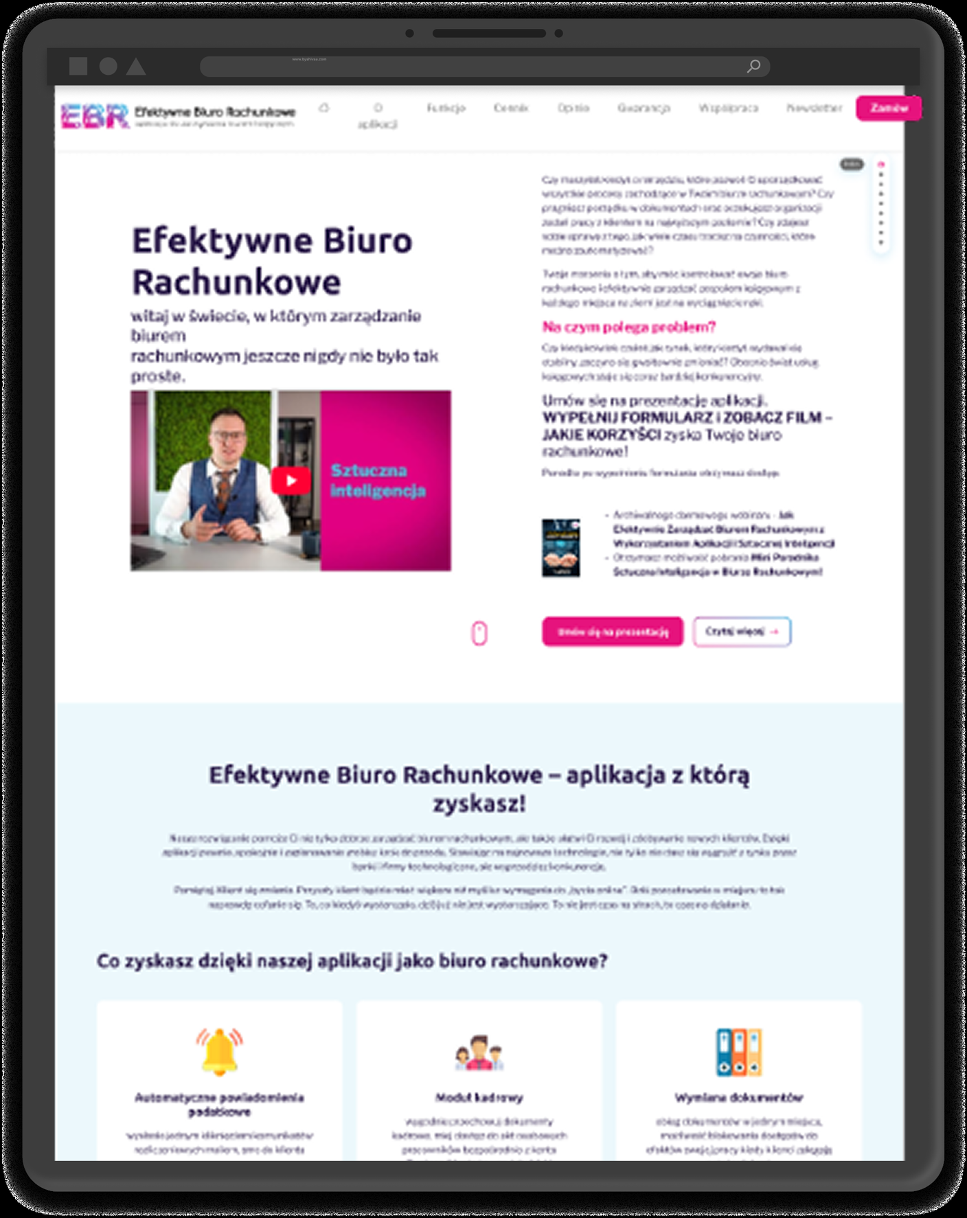
The previous page was dense and chaotic: a lot of text, low contrast, and a weak hierarchy meant the key message and call-to-action buttons got lost. The goal was to simplify the messaging, highlight the benefits, and guide the user straight toward booking a demo.
The starting point was a brief from the client and my own UX analysis of the existing page. I reviewed the previous version for hierarchy, readability, and the path to the CTA, then turned those findings into a list of problems to solve — without formal user research, but with a concrete read on where the key message was getting lost.
Goal: quickly judge whether the tool would improve the office's work and book a demo.
Frustration: a wall of text with no clear message made the offer hard to evaluate.
Goal: understand how the tool would make day-to-day client and document handling easier.
Frustration: an unclear hierarchy and scattered CTAs didn't lead to a next step.
I ran the redesign step by step: first trimming the messaging, then building the hierarchy and a consistent visual system, and finally straightening out the conversion path.
One strong headline instead of a wall of text — it's immediately clear what the product offers.
Clear content levels, contrast, and space — key elements stopped getting lost.
Consistent typography, color, and components as the foundation of the whole page.
One clear route to booking a demo — repeatable, predictable actions.
Drag the slider (or use the arrow keys) to compare the previous and new versions of the page.
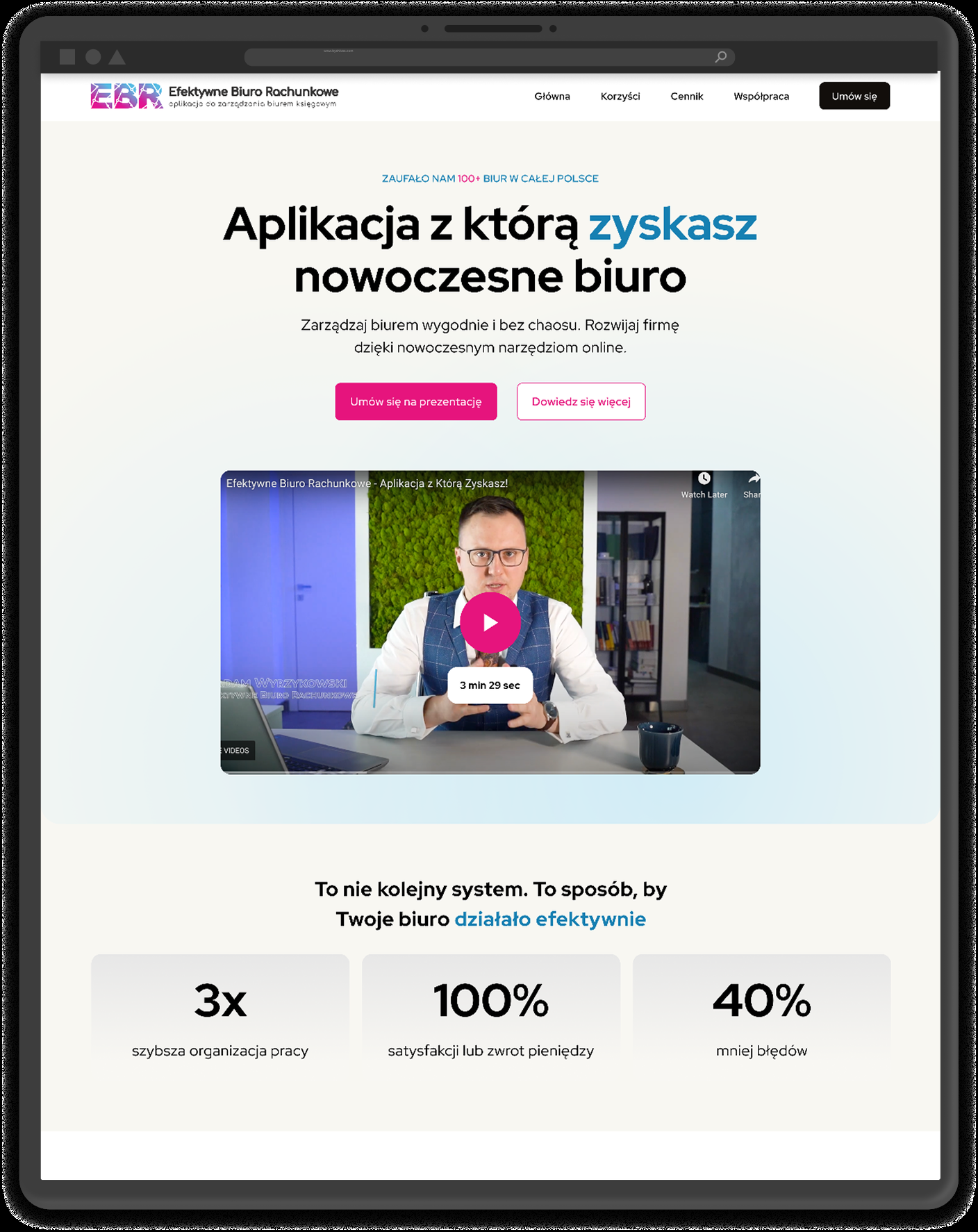
The new version: one strong headline, breathing room around the content, a clear CTA, and a stats section that builds trust — instead of a wall of text.
A consistent visual language built on legible typography and a bold palette: energetic magenta as the action color, navy for headings, and blue as an accent.

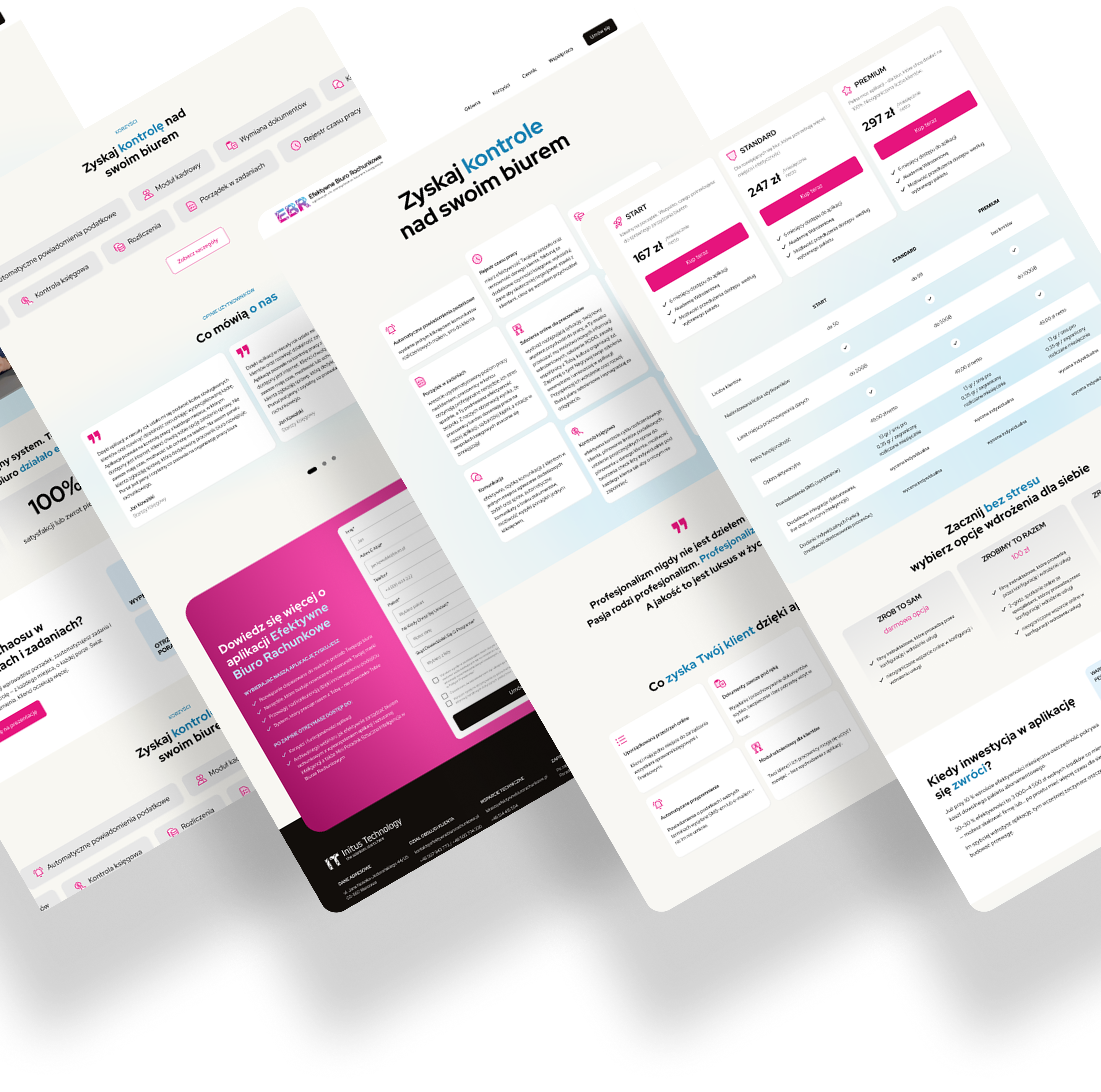
I was responsible for the UX/UI redesign of the page — from simplifying the messaging, through building the hierarchy, to a consistent visual system and a straightened conversion path.
The new version achieves the intended design goals: instead of a wall of text, it guides the user clearly through the offer all the way to contact.